 |
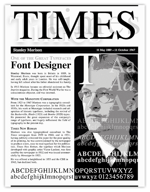
| This is simple illustrated typographic hierarchy. Headline, intro copy, subheads and text/copy. |
How you arrange, organize and prioritize the elements in your design conveys information to the viewer about how important they are. Visual hierarchy helps the viewer comprehend, reinforces your message, and guides the viewer through your story. Establishing hierarchy in design is simply organizing objects (type, imagery, etc) into different levels of relative significance.
Visual hierarchy creates organization and prioritization through the use and placement of visual elements. Using basic design principles allows you to emphasize one element over another so more important content looks and presents as more important. Placing the elements so they are on the same level of visual hierarchy can create a sense of visual tension, a visual tug of war of sorts. This visual struggle can result in the design feeling cluttered and disorganized leaving the viewer confused.
Properly established visual hierarchies create focal points in your design, communicate additional meaning through convention and repetition, highlight actions you want your reader to take and establish patterns of movement and flow.
 |
| It helps to understand eye-flow, and that we read left to right; top to bottom, when creating a good easy to follow visual hierarchy |
Try asking yourself this simple question: what do I want the viewer to see first, second, third? Placing the elements in the composition according to the predetermined numbered list is a simple but effective way to start establishing visual hierarchy.
USE THE GRID
The easiest and best way to arrange and organize your elements and design content is to use the grid system. See the simple 2 and 4 column grid examples shown here. I also put it to use with the "TIMES Great Typefaces" assignment example.
 |
| With grid and guidelines on and below with them off. |


